Street SmART
Street SmART
Street SmART
In this individual school project, I designed the UI for an app called "Street SmART" that guides tourists around San Francisco through the lens of mural artwork.
In this individual school project, I designed the UI for an app called "Street SmART" that guides tourists around San Francisco through the lens of mural artwork.
In this individual school project, I designed the UI for an app called "Street SmART" that guides tourists around San Francisco through the lens of mural artwork.


Focus
We were asked to create a conceptual site guide for a specific site for mobile use, with 4 interior pages. This entailed designing the UI for an app that serves as a guide to our selected site using any criteria we created. I chose San Francisco and my tour of the city is through mural artwork. San Francisco has a spectrum of murals and using them as stopping points gives a glimpse into the history of the city and its relationship to street art. My main users are tourists and people who aren't familiar with navigating San Francisco.
My goal was to create a visually engaging and interactive map that served as the central point of navigation and control for the user. The home screen conveys more contextual information and is a starting point for making choices on where to go through the curated collection of different types of murals. Through the UI, I focused on capturing the experience of exploring the street art of San Francisco. I used Figma to design and prototype all the elements of my project.
Design Process
Background Research
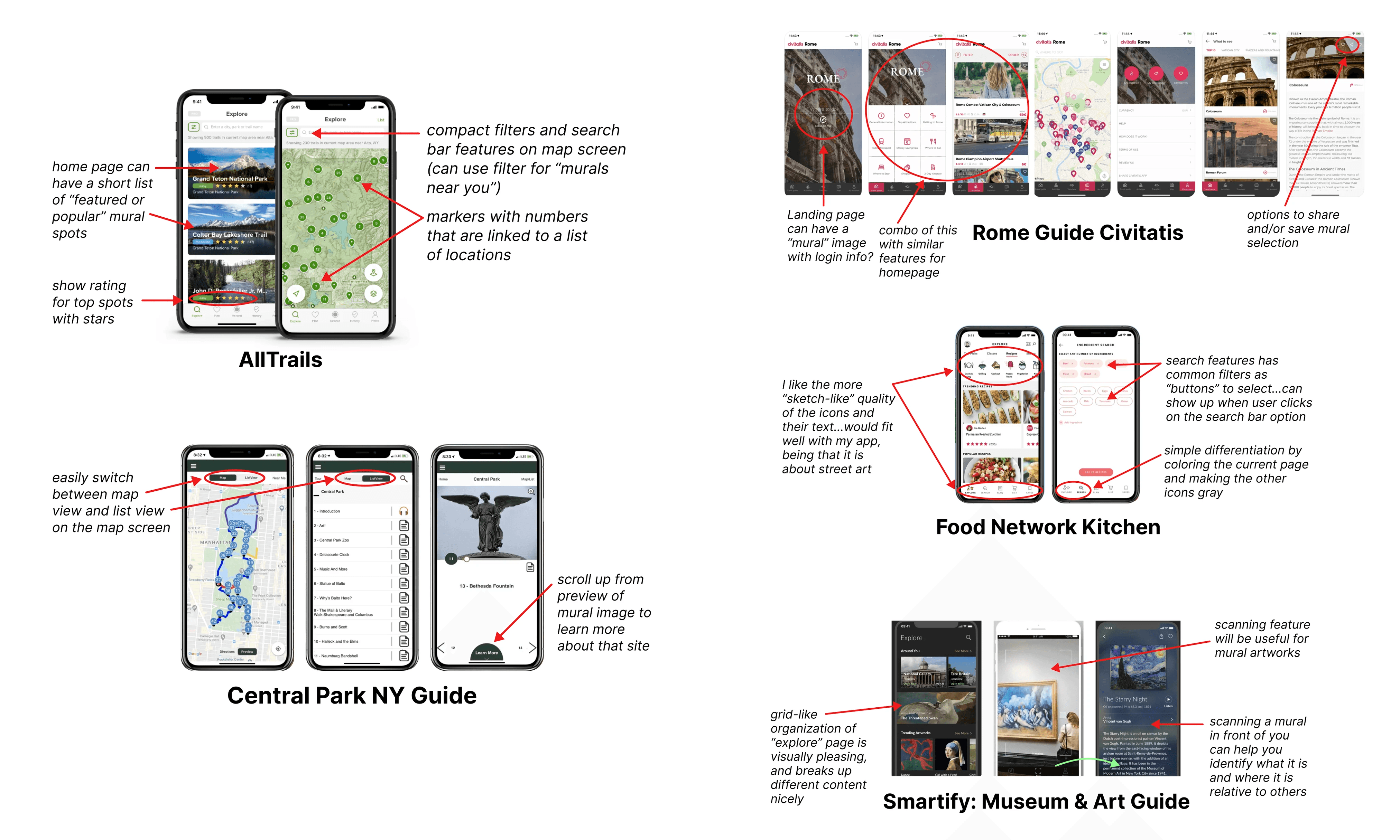
I researched and did an app breakdown of 5 existing tour-guide apps that used navigation/organization and scale elements, as well as a map interface. I used this initial research to inform my design.
AllTrails - an app to find the best hiking, running, and biking trails around the world
Central Park New York Guide - an app that has a GPS-enabled offline walking tour of Central Park
Rome Guide Civitatis - an app for finding/booking activities and guided tours around Rome
Food Network Kitchen - an app that gives users access to cooking classes and recipes among other features
Smartify: Museum & Art Guide - an app that scans artworks and returns information about them
Content & Navigation
Main Concept
Users can use this app to explore San Francisco through mural art to experience the rich and diverse history of street art
Help users find murals near their location and learn about important landmarks in the city
Showcase a curated selection of the city's 1000 murals
Focus
We were asked to create a conceptual site guide for a specific site for mobile use, with 4 interior pages. This entailed designing the UI for an app that serves as a guide to our selected site using any criteria we created. I chose San Francisco and my tour of the city is through mural artwork. San Francisco has a spectrum of murals and using them as stopping points gives a glimpse into the history of the city and its relationship to street art. My main users are tourists and people who aren't familiar with navigating San Francisco.
My goal was to create a visually engaging and interactive map that served as the central point of navigation and control for the user. The home screen conveys more contextual information and is a starting point for making choices on where to go through the curated collection of different types of murals. Through the UI, I focused on capturing the experience of exploring the street art of San Francisco. I used Figma to design and prototype all the elements of my project.
Design Process
Background Research
I researched and did an app breakdown of 5 existing tour-guide apps that used navigation/organization and scale elements, as well as a map interface. I used this initial research to inform my design.
AllTrails - an app to find the best hiking, running, and biking trails around the world
Central Park New York Guide - an app that has a GPS-enabled offline walking tour of Central Park
Rome Guide Civitatis - an app for finding/booking activities and guided tours around Rome
Food Network Kitchen - an app that gives users access to cooking classes and recipes among other features
Smartify: Museum & Art Guide - an app that scans artworks and returns information about them
Content & Navigation
Main Concept
Users can use this app to explore San Francisco through mural art to experience the rich and diverse history of street art
Help users find murals near their location and learn about important landmarks in the city
Showcase a curated selection of the city's 1000 murals
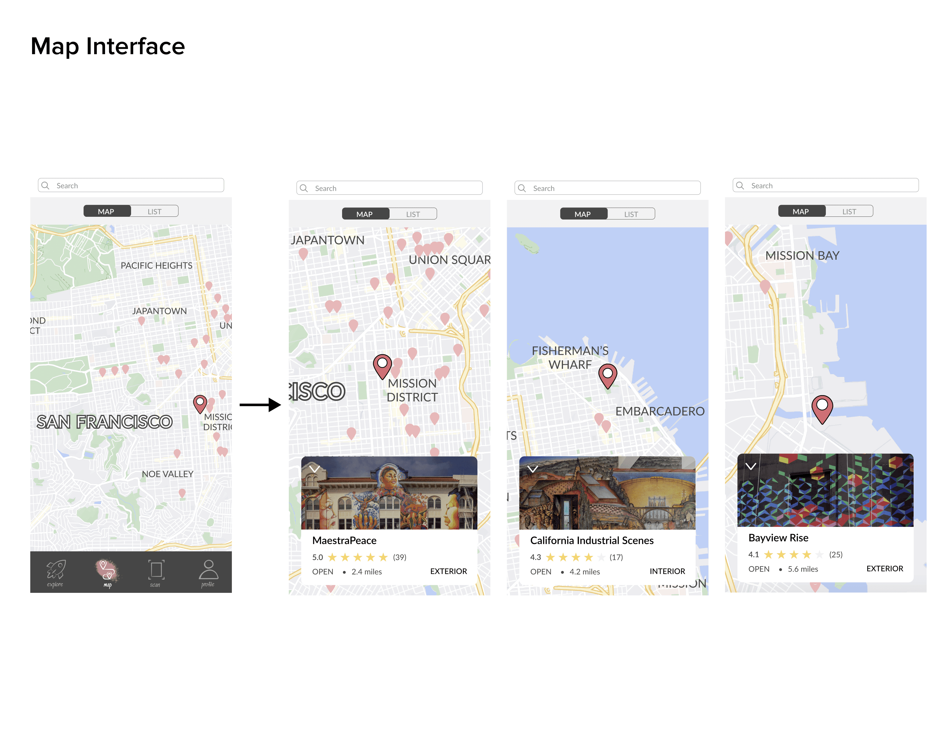
Navigation & Layout
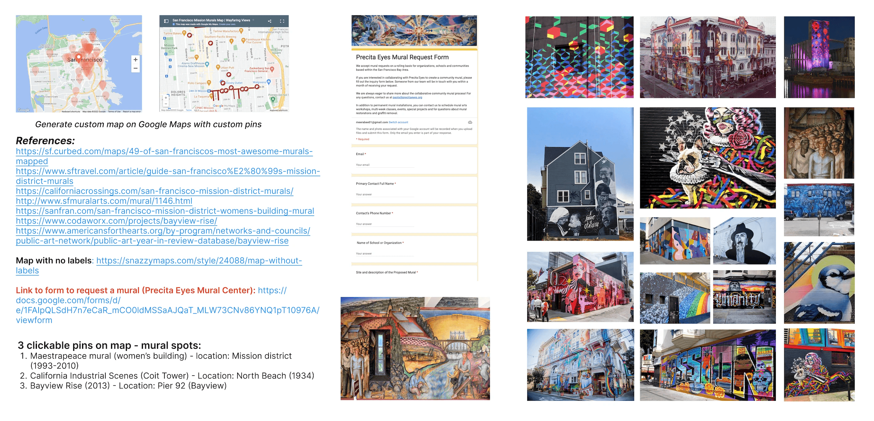
30-40 mural locations (pins) on the map, only 3 clickable → 3 interior pages
4th interior page has a place for a gallery of images, or a form to connect artists with requests or any relevant news
Navigation bar: Home, Map, Scan, Community, Saved
Landing page
Home: featured murals (most popular locations via a gallery of images)
List with links to walking tours in that area to get a more guided tour of muralsMap: pinned locations (30-40); 3 clickable pins
Each pinned location brings up a pop-up window with more information, photos, links, and reviews
Include a search feature and zoom feature
Scan: A camera for scanning a mural to identify what it is, where it is and to get more information
Community: Users can add a review and see any relevant news/updates
Form to connect artists with any new mural requests
Saves: A collection of user's past saved murals and locations they've visited
Navigation & Layout
30-40 mural locations (pins) on the map, only 3 clickable → 3 interior pages
4th interior page has a place for a gallery of images, or a form to connect artists with requests or any relevant news
Navigation bar: Home, Map, Scan, Community, Saved
Landing page
Home: featured murals (most popular locations via a gallery of images)
List with links to walking tours in that area to get a more guided tour of muralsMap: pinned locations (30-40); 3 clickable pins
Each pinned location brings up a pop-up window with more information, photos, links, and reviews
Include a search feature and zoom feature
Scan: A camera for scanning a mural to identify what it is, where it is and to get more information
Community: Users can add a review and see any relevant news/updates
Form to connect artists with any new mural requests
Saves: A collection of user's past saved murals and locations they've visited
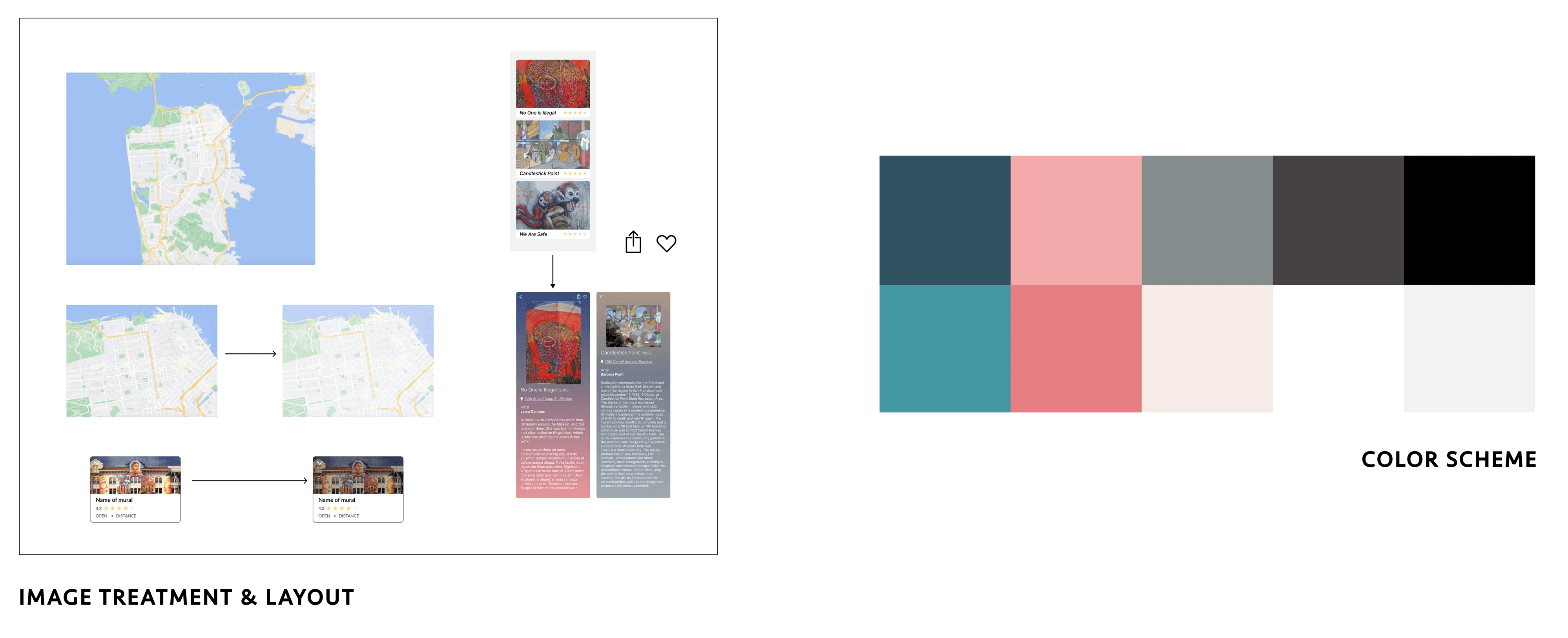
Visual Design Elements
All visual elements were carefully chosen to reflect the essence of street art but also bring in colors associated with San Francisco.
The subdued, pastel-like red and blue hues were inspired by landmarks and the atmosphere of the city
Heading and display text reflects a grunge, street-art style of lettering and is paired with a sans-serif font that is readable for large blocks of text
The design of the icons started with simple lines and shapes and evolved to match the grunge but minimalist style of the fonts
Graphics are evocative of paint splashes, brush strokes, and other shapes associated with street art
Image treatment includes subdued, darker overlays to emphasize text when necessary

Wireframing
I started with grayscale wireframes to figure out the general shapes and placement of text without the distraction of any colors. I also evaluated how the navigation bar, search bar, and other key interactive elements such as the map pins and toggle buttons work together. The goal was to understand their collective impact on guiding the user through the app.
I chose to lay this out this way because most users' most familiar touchpoint with a map interface is the Google Maps feature. Therefore, the Street Smart app's UI is an extension of what people already know, allowing them to focus on the content, rather than trying to learn how to use a new type of map interface.

UI Components
APPLYING COLOR & TYPE
The next step was applying some images, typography, and colors to test out the main UI elements the user would interact with. In this phase, I gained insights into the app's overall layout, user navigation dynamics, and the relationships between text, images, graphics, and white space for different screens.

Hi-Fidelity Prototype
FLOW OF SCREENS

DIFFERENT VISUAL LAYOUTS


USER INTERACTION SCREENS
USER INTERACTION SCREENS

USER INTERACTION SCREENS
HI-FI PROTOTYPE
Next Steps
If I were to take this project further, my next step would be to conduct several usability studies to evaluate the design and functionality of the prototype. I would use this user feedback to continue to refine my design.
Next Steps
If I were to take this project further, my next step would be to conduct several usability studies to evaluate the design and functionality of the prototype. I would use this user feedback to continue to refine my design.
Next Steps
If I were to take this project further, my next step would be to conduct several usability studies to evaluate the design and functionality of the prototype. I would use this user feedback to continue to refine my design.
USER INTERACTION SCREENS
Visual Principles of the Screen
Washington University in St. Louis | Fall 2022
Professor Jodi Kolpakov
Visual Principles of the Screen
Washington University in St. Louis | Fall 2022
Professor Jodi Kolpakov
Visual Principles of the Screen
Washington University in St. Louis | Fall 2022
Professor Jodi Kolpakov